Agency: Field Day
Client: Waitrose
Brief: Redesign the entire Waitrose CRM email templates (MyWaitrose, Waitrose.com, Waitrose Garden, Waitrose Cellar, Waitrose Pet, and Waitrose Florist).
Outcome: During my time at Field Day I became the main designer for our client Waitrose. From checking designs done by other designers to being in on meetings to brain storm new ideas for the client. I was tasked with redesigning the emails for Waitrose. They wanted them to be more unified and responsive so I stripped the designs they already had back to the basics. Working with our accounts team and the copywriters we stripped back the amount of information Waitrose would try to fit into their emails and made them easier to read/navigate. I used larger images spaces and made use of the white space between pods to give each pod more breathing room whilst making sure it followed through to mobile. Each Waitrose template has a specific use for that devision of Waitrose. I created over 150 various pod designs and various style guides that are easy to use and easy to follow.

Various MyWaitrose pod designs
MyWaitrose needed to be simple and to the point, its main goal is to drive people to the website to buy products with the offers they receive through the email. Only the hero pod is given a rectangle button as that is typically the main offer and selling point Waitrose want to drive to its customers.
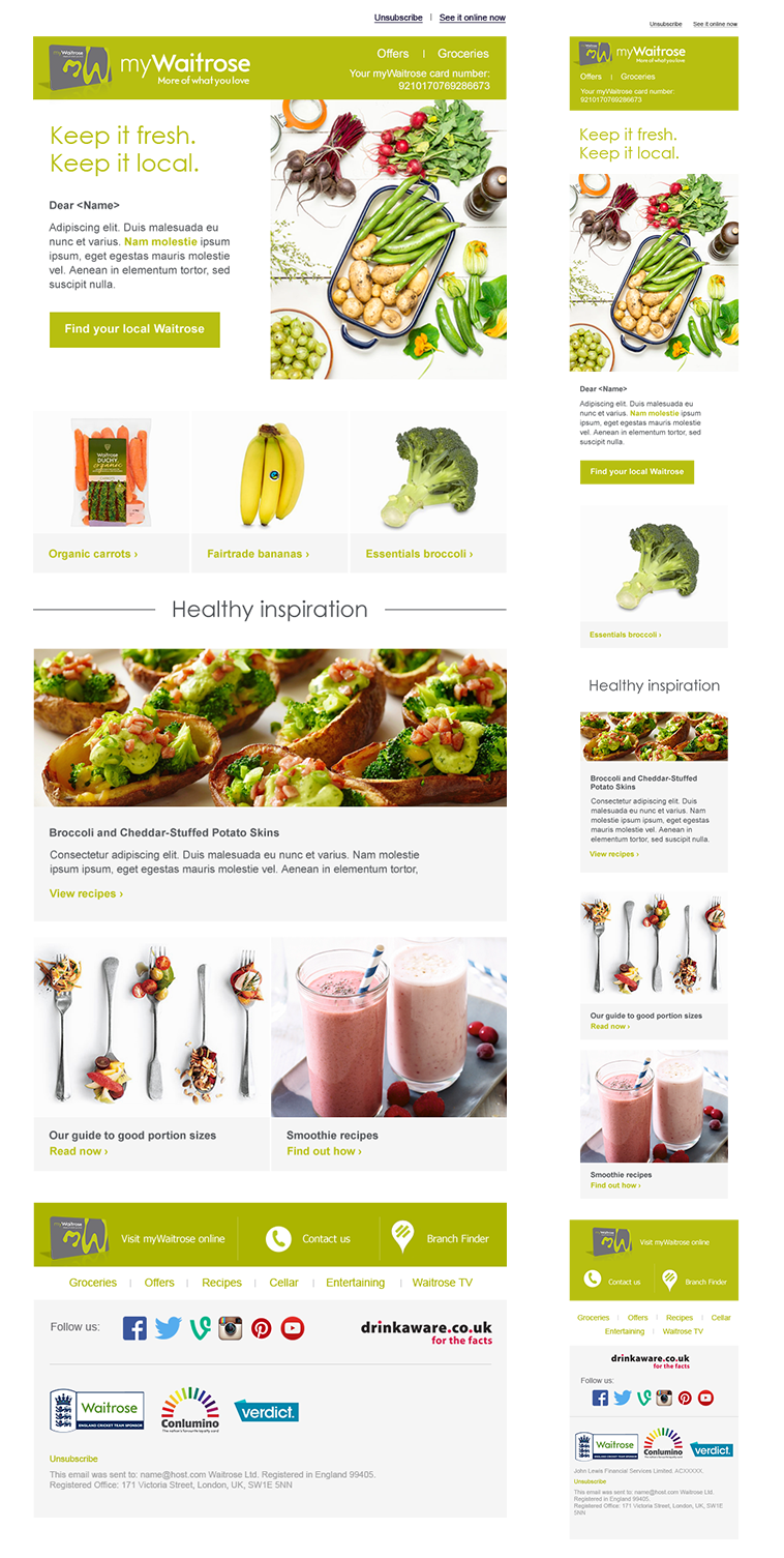
MyWaitrose example email

Various Waitrose Direct (Florist) pods
Waitrose Direct (Florist, Cellar, Garden, and Pet) emails are targeted towards customers who either buy lots of a certain product or are after products that are more specialised and higher in quality. These email templates needed to all follow the same design but they also needed to have their own unique pods, for example; Cellar needed taller image sizes for their bottles of wine whilst garden needed more square images for their products. Only the main call to action is in a block colour whilst the rest utilise outlines to make the content easier to read and navigate.

A bite size version of the 70 page style/user guide for the client, designers, and developers to use in order to make sure the Direct emails follow the same rules.

Waitrose Direct; Florist email example
